Business cards remain a small but important part of modern networking. Even when you share links and QR codes, passing a card across the table gives the other person something physical that keeps your name, role, and contact details in front of them. A card can sit in a wallet, planner, or desk drawer long after a first meeting, and people often reach for it when they finally need to call, email, or book a service. Free business card templates for Word and Google Docs remove the guesswork around card size, margins, and layout so you can concentrate on your message and visual style. In the collection displayed above, you can browse different designs, pick the layout that suits your brand, then personalize it inside programs you already use.
Business Card Templates
Beige Makeup Artist Business Card Template


Black and White Sport Car Business Card


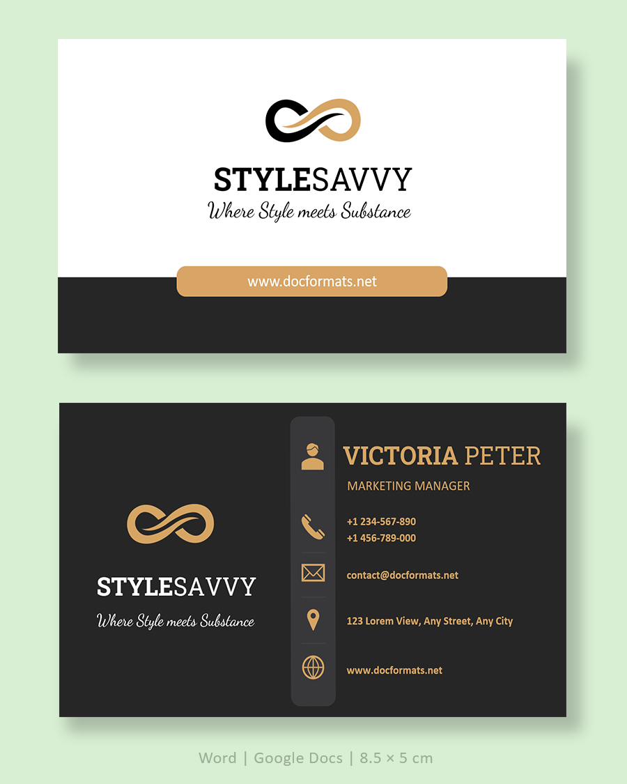
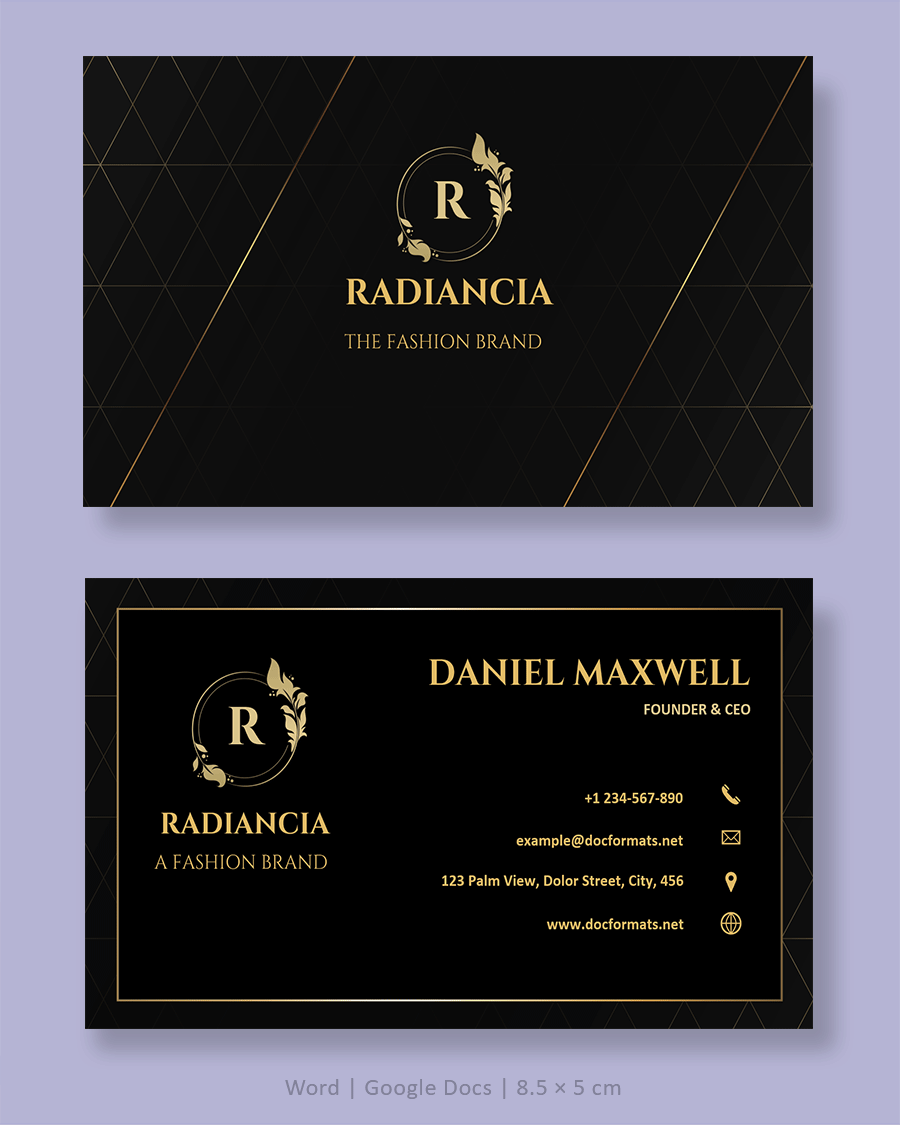
Black Gold Elegant Business Card Template


Black Gold Elegant Business Card Template


Black & Gold Minimal Business Card Template


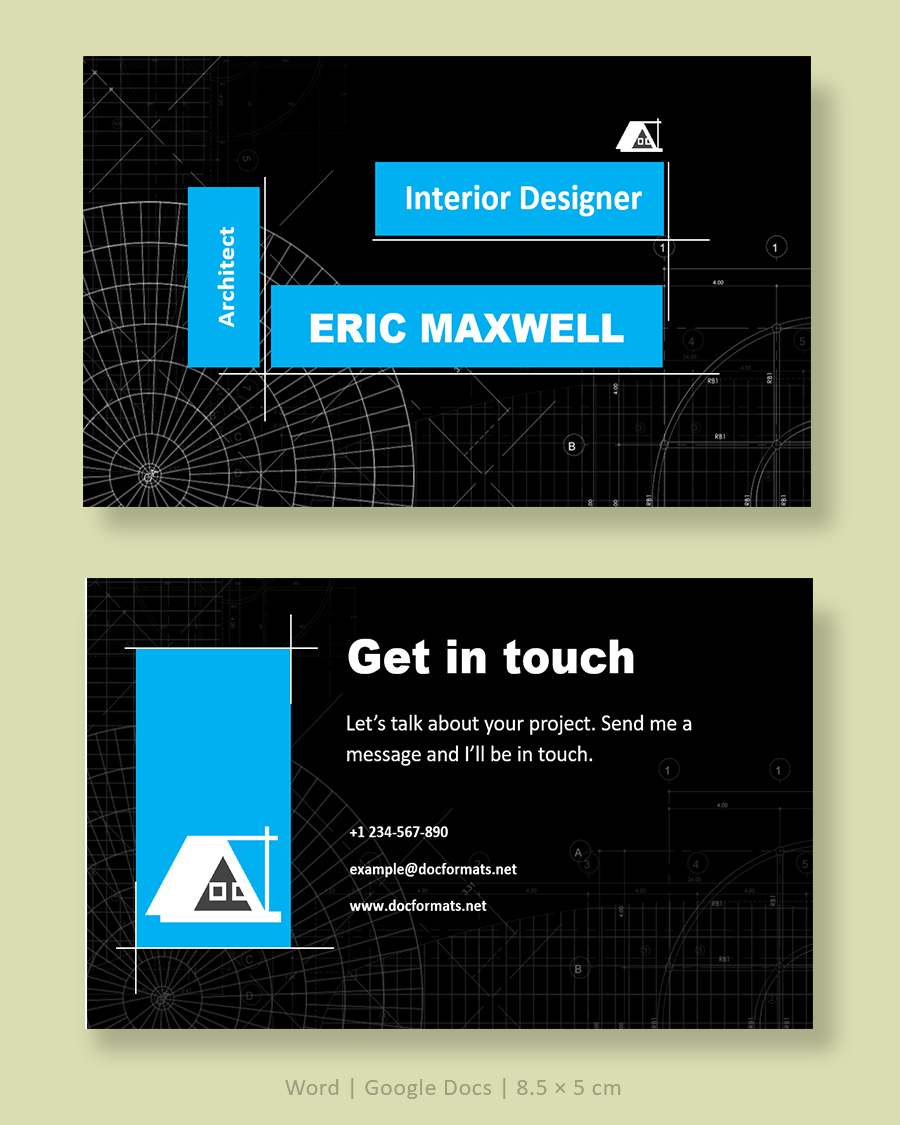
Blue Architect Business Card Template


Blue Minimal Business Card Template


Brunch Business Card Template


Elegant Yellow Business Card Template


Gold Elegant Business Card Template


Grey and Blue Minimal Business Card Template


Grey Photographer Business Card


Macarons Business Card Template


Makeup Artist Business Card Template


Minimal White Business Card Template


Navy and Gold Business Card


Orange Business Card Template


Professional Business Card Template


Purple Business Card Template


Purple Gradient Business Card Template


Purple Minimalist Modern Business Card


Red and Black Business Card Template


Red and White Business Card Template


White Minimal Business Card Template


Black and White Personal Business Card Template


Black White Modern Business Card Template


Professional Real Estate Agent Business Card


Minimalist Modern Business Card Template


What Is a Business Card?
A business card is a small printed card that identifies you and explains how people can contact you. It usually fits easily into a wallet, card holder, or planner pocket, so it can stay with someone long after your first conversation.
Despite all the digital ways to share information, business cards still appear at meetings, conferences, trade shows, local events, and even casual introductions. A card gives you a brief moment of connection when you hand it over. It does not depend on a battery, a signal, or any specific app. Someone can reach for the card days or weeks later and still see the same information. It also condenses your identity and contact details into a form that feels deliberate, not improvised on the spot.
When you design or adapt a business card template, you are shaping that small, lasting reminder of who you are and what you do.
Essential Elements of a Business Card Template
Most effective cards contain a similar set of elements. Layouts change, but the core details tend to stay the same.
- Full name. Use the same version of your name that appears on your website and email signature so people see consistency across channels.
- Job title or role. Briefly describe what you do, such as “Real Estate Agent,” “Marketing Consultant,” “Pediatric Dentist,” or “Wedding Photographer.” This line gives context when someone looks at the card later.
- Business or practice name. Include the official name of your company or clinic, written exactly as it appears in your branding and legal documents.
- Logo or brand mark. A logo, monogram, or distinctive typographic mark anchors the visual side of the card and helps people recognize your brand at a glance.
- Primary phone number. List one number where clients genuinely reach you. Avoid adding multiple numbers unless you truly use them for different purposes.
- Professional email address. Use an address linked to your business domain if you have one, for example “[email protected]” instead of a casual personal account.
- Website or portfolio link. Add one short, easy-to-type URL that leads people to your main site, booking page, or portfolio.
- Physical address or city and state. This matters if clients visit you in person, or if you work within a specific local area.
- Social profiles. Include only the platforms you actively maintain for professional communication, such as LinkedIn, Instagram, or a Facebook page.
- Optional QR code. Many modern cards include a small QR code that links to your contact card, website, or booking form so people can scan instead of typing.
Beyond Content
Layout decisions have a strong effect on readability. Legible fonts, sensible font sizes, and enough white space between lines all contribute to a card that someone can scan quickly in real situations. Even small changes in spacing or contrast can decide whether a person keeps your card or sets it aside.
How to Use These Business Card Templates
You can adapt the templates in this collection from start to finish using only Word or Google Docs. The process feels manageable once you follow a consistent routine.
Step 1. Open and save your template
Download the Word version or create a copy of the Google Docs version, depending on your preferred program. Before editing anything, save a master copy in a clearly labeled folder. You can then duplicate this file whenever you need cards for another team member or a revised version for yourself.
Step 2. Replace placeholder details
Work through the card from top to bottom and replace placeholder text with your own information. Start with your name and role, then move to business name, contact lines, and any short tagline you use. Insert your logo file and resize it gently so it stays sharp and proportional rather than stretched.
If the page contains multiple copies of the card, check that all of them update correctly. Some templates link the text boxes so changes on one card carry through automatically; others require you to paste updated content into each card.
Step 3. Adjust fonts and colors
Once your details are in place, align the visual style with your existing brand materials. Pick one or two font families that match your website or marketing documents. Keep your name slightly larger or bolder than surrounding text so it stands out. Keep contact lines within a comfortable reading size and avoid very thin or ornate fonts for small text.
Update background colors and accent shapes to match your logo or website palette. If your logo already uses strong color, you may decide on a mostly white or very light background so text remains easy to read.
Step 4. Confirm layout and safe areas
Before printing, confirm that the card still follows a standard business card format for your region. In practical terms this means checking margins and safe areas rather than relying on exact measurements.
Most printers and design guides recommend a “safe area” inside the card where no essential text or logos come too close to the edge. If your template includes background color or images that extend to the edge, it may also add a small outer margin used as bleed. That extra border is trimmed after printing so you avoid thin white lines around the design.
In Word, open “Page Setup” to review page layout and margins. In Google Docs, open “Page setup” from the File menu and review the same details. Focus on consistent spacing from edges rather than numeric values.
Step 5. Export and print
When the design looks right on screen, export the file as a PDF. This format keeps fonts and layout stable when you move the file between devices or send it to a print shop.
You can then:
- Print at home or in the office. Use heavy card stock and select the highest quality print setting. Print one test sheet first to see how colors, sharpness, and cutting guides look on paper.
- Use a professional printing service. Upload the PDF to a local or online printer. Review their digital proof carefully and check that text is readable, colors match your expectations, and important elements sit inside the safe area.
Keep the final PDF along with your editable Word or Docs file so you can reorder cards easily whenever you run low.
Design Best Practices for Readable Cards
Good design decisions make your card easy to scan, even in busy or low-light situations. You do not need advanced design training to apply a few reliable principles.
Keep information focused
A business card has very limited space. It works best when it highlights identity, role, and main contact channels instead of trying to list everything you do. Long service lists, multiple phone numbers, or extensive taglines can quickly crowd the card and hide the details people actually need.
If you want to explain services in more depth, you can send people to your website, a brochure, or a one-page handout. The card’s job is to guide people toward that next step, not to hold every detail on its own.
Use visual hierarchy and white space
Visual hierarchy means that some elements are deliberately more prominent than others. Your name might appear in a larger or bolder font, followed by your role and business name. Contact details appear in smaller type but still remain readable.
White space, the empty area around text and images, plays a bigger role than many people expect. Extra room around your name, logo, and main contact lines makes the card feel calmer and easier to read. When everything is pushed to the edges or packed into tight lines, people have to work harder just to scan the card.
Choose fonts and colors with care
Decorative fonts can look appealing on screen but may blur when printed at small sizes. Clean, simple fonts with solid strokes usually hold up better in print, especially for phone numbers, email addresses, and website URLs. Avoid very thin fonts for small text, and keep contact lines at a size that remains readable at arm’s length.
For color, maintain strong contrast between text and background. Dark text on a light background or light text on a dark background tends to read best. If you use photographs or gradients behind text, print a test sheet to confirm that letters do not disappear into the background.
Plan for both sides of the card
Many of the templates in your collection show both front and back designs. Think about how the two sides work together. The front can focus on your name, role, and key contact details. The back can feature a logo pattern, QR code, appointment table, or a short list of services.
If you expect clients to write appointment dates or notes on your card, consider leaving one side mostly blank or lightly colored and avoid very glossy finishes that resist pen ink.
Printing and Paper Considerations
Paper choice and printing method have a strong impact on how your card feels when someone holds it.
Heavier card stock tends to feel more substantial and is less likely to bend in a wallet or pocket. Many printers list card weights specifically for business cards, so you can simply choose from those options. Matte finishes reduce glare and work well for cards people may write on. Glossy or satin finishes can suit designs with strong color or photography. Some printers also offer textured or soft-touch finishes for a more distinct feel.
When exporting your PDF, use a high-resolution setting so small text stays sharp. Commercial printers often share recommended export settings on their websites. If color accuracy or finish is important for your brand, consider requesting a printed proof before committing to a large batch. A single sample often reveals issues that are hard to notice on screen, such as color shifts, line thickness, or small alignment changes.
Whenever possible, print one test sheet first. Check that text is readable, colors look close to what you expected, and cutting marks align with the template layout. Adjust the file if needed, then go ahead with your full order.
When To Update or Reprint Your Business Cards
Business cards remain useful only while the information on them is current. Plan to update your template and reprint cards whenever there is a meaningful change in your details or branding.
Common triggers include:
- Contact details. New phone numbers, email addresses, physical locations, or website domains.
- Brand identity. New logo, revised brand colors, or a refined tagline.
- Role or services. Promotions, additional qualifications, or a shift toward different types of work.
Keep your original Word or Google Docs template in a safe folder so adjustments only take a few minutes. You can then export a fresh PDF and order a new batch without starting from the beginning each time.
FAQs
Yes. The templates on this page are available as free downloads for Word and Google Docs. As with any resource, you should read the usage note or license on the download page, especially if you plan to use the designs for commercial printing or client projects.
You can adjust dimensions in page setup, but doing that often affects margins, safe areas, and how easily printers can cut the cards. In practice, it is usually easier to stay with a standard business card format and make your changes within that layout instead of changing the overall size.
Look for card stock specifically sold for business cards or heavy cover stock that your printer supports. A matte finish works well for cards that might be written on, while a glossy or satin finish can suit photo-heavy or color-intensive designs. If you are unsure, ask your print provider for a small sample or recommendation.
Yes. You can generate a QR code that links to your website, booking form, or digital contact card, then insert it into the template as an image. Place it away from the card edges and from very dense text so scanning remains reliable.
Yes. Many businesses keep one master template in a shared folder, then create a copy for each employee. This approach keeps fonts, colors, and layout consistent across all cards, while each person fills in their own name, role, and contact details.